Blizzard uses internal tools for daily operations, some older and some newly developed.
Building tools from scratch is time-consuming. We created Mosaic, a design system to streamline development.
Scope: System Audits, component designs, developer handoff
Time: Approx. 1 year
Brainstorm: Miro, Jira, Google Suites
Design: Figma
Insights: Dovetail
Collaboration: Zoom, Slack
UX Designer
We developed Mosaic, a foundational atomic system of styles and components that powers the creation of internal tools.
Reusable components enable rapid iteration, prototyping and seamless theming.
Designer-developer collaboration ensures seamless implementation from Figma to Storybook.
Growing interest in the design system led to a public Slack channel for sharing its benefits!
While many internal tools were built years ago, new features and tools are developed to support growing teams and streamline workflows.
For instance, there were numerous updates to Keyring, the employee game benefits tool, and SupportDesk, the main support sit. We also redesigned a new employee crediting tool.
Managing multiple design systems across themed internal tools became challenging, with variations in layout, states, and structure.
Audits revealed inconsistencies, and some platforms lacked a system entirely, making feature design time-consuming.
Building new tools meant creating a new design system/library each time. This is time-consuming, and can be streamlined by having a base design system in place!
Our goal is to build a scalable base design system that supports themes and future applications, eliminating the need for multiple systems.
For each component, I audit Blizzard’s systems, analyze use cases, and identify challenges. I research best practices, document states and guidelines, and prioritize design in a spreadsheet.
Working with developers, I learned they integrate and reference Tailwind CSS. Aligning designs with it streamlines development for both teams.
Based on research insights, I build low-fidelity components to capture structure and understand what properties we can manipulate.
Designer feedback
Design feedback is collected to gain early feedback on style choices, features and use cases,
Developer feedback
Developer feedback is collected shortly after revisions are made based on feedback from design. This is mainly feedback on implementation, customization, feasibility, and functionality.
Prioritizing accessibility improves usability, compliance, and inclusivity. We used Figma plugins and consulted a colorblind colleague for color choices.
Next time, I’d like conduct accessibility tests on the design system.
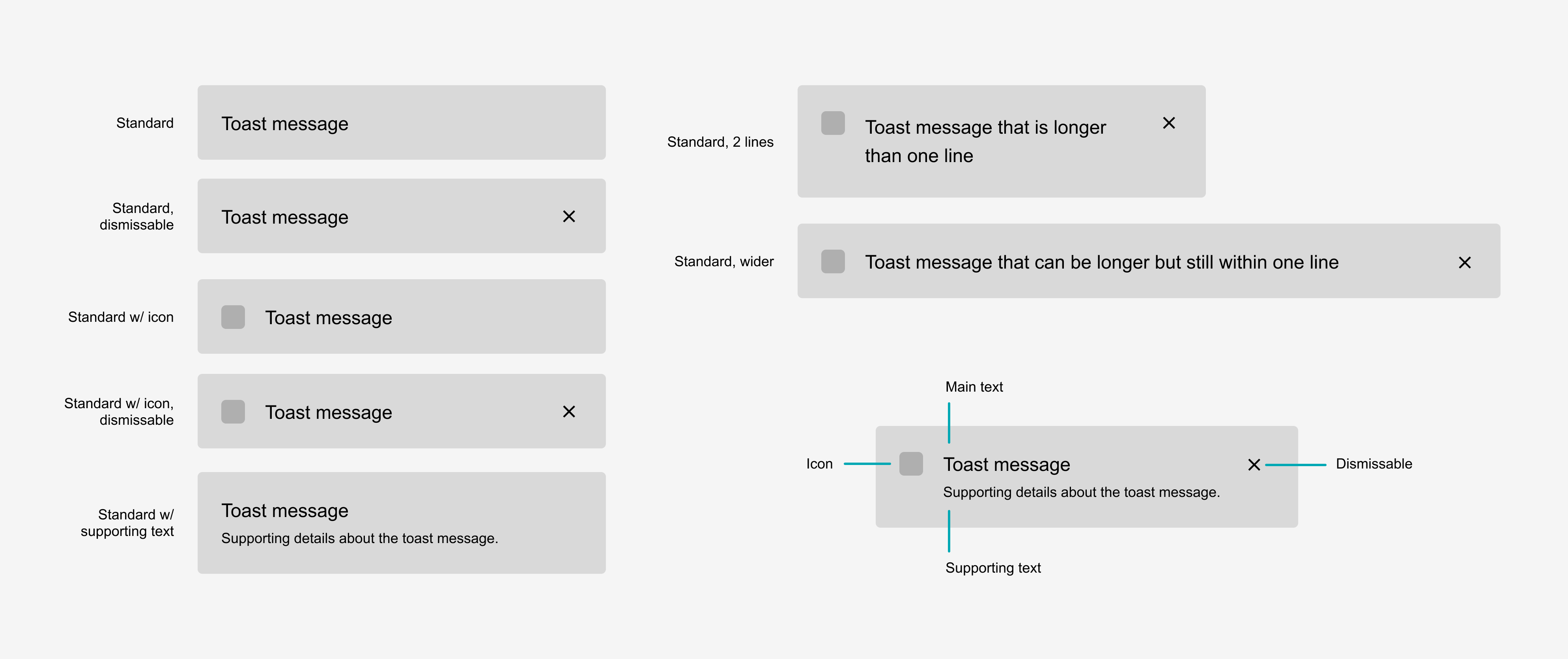
I set customizable properties for designers in Figma and developers in Storybook. Variants make it easy to adapt components for different use cases.
Our base component allows easy customization for different platform themes. We support light and dark modes to ensure accessibility standards are met in each theme (while still monitoring them as we go).
Design systems are vital for both designers and developers. Collaboration improved implementation, documentation, and component quality in Figma and Storybook.
Mosaic follows an atomic structure, with atoms as the smallest unit and building up hierarchically.
Atomic Design System diagram pulled from Atomic Design by Brad Frost
Example of atomic structure in Mosaic
We started building atoms first when we kept having to make choices about colors and font sizes.
We moved to prioritize defining colors, typography, grid layout, border radius, and drop shadows to be applied across the rest of the components.
Atoms include input and interaction elements like buttons, tags, and toggles, as well as UI enhancements like progress indicators and more.
The atomic design structure allows us to create larger components by utilizing smaller components within.
I documented each component with usage guidelines, customizable properties, and states to effectively communicate the system to developers and designers.
Icon library usage and download documentation
Documentation for each component
Overall design system documentation upon opening file
The new design system established a consistent foundation and enhanced workflow for the entire team. All additions and edits are published so the library stays up-to-date.
Scroll through to preview some styles and components from Mosaic on Figma.
Since the development of this design system, we have added multiple features to existing platforms, and created a whole new site from scratch.
Wins ᵔᴗᵔ
Credits screens made with Mosaic components
Mosaic provides customizable properties for each platform’s design. With Figma variables, we easily switch themes.
See how we tailored one component for a specific platform below.
A design system is never finished. We continuously add components and refine existing ones as use cases evolve.
For example, while designing the Blizzard Crediting Dashboard, I identified the timeline as a valuable addition!
With a base design system, designers and developers can quickly build and maintain tools using preexisting components.
Each component is refined in detailed discussions between developers and designers. Quality checks maintain the high standard of each component.
Mosaic’s main users were designers and developers in my department. Design system advocation led to growing interest and a public Slack channel to share its benefits with curious teams!